Navigator + Sensei AI
Designing Data-to-Action Learning Systems at Scale
Executive Summary
The Mission: Transform fragmented assessment data into clear, role-specific teaching actions across a multi-role learning platform.
"Turning a reporting tool into a decision support system and building the foundation for an AI product ecosystem across two countries."
The Challenge: Design a unified platform for four completely different user roles — Students, Teachers, Mentors, and Ops teams — each with different mental models, within the constraints of large classrooms, limited digital maturity, and high-stakes national exams.
The Role:
Oct 2023 – Apr 2025 · Benesse Holdings · Senior Product Designer
Joined to fix UI inconsistencies, reframed the entire product architecture, and led end-to-end design from heuristic evaluation through a four-product ecosystem spanning India and Japan.
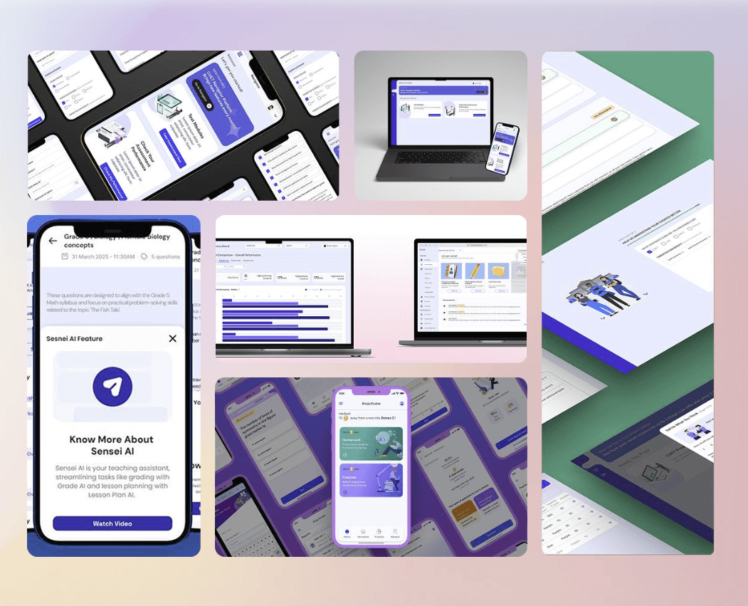
Business Impact: +25% teacher engagement, ~70% reduction in ops support tickets, and a design foundation that directly spawned three follow-on products AI Drill, Sensei AI, and Keybo across two countries.
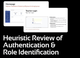
I Came to Fix UI. I Stayed to Redesign Thinking.
But here's what happened on day one of my heuristic evaluation,
I stopped looking at pixels and started looking at people. And what I saw was a platform that had data everywhere and clarity nowhere.
Teachers were logging in to a system full of assessment results and walking away with no idea what to do next. Students were navigating multiple disconnected tools with inconsistent login flows. Operations teams were drowning in support tickets during peak exam cycles — not because the system was broken, but because it was designed for data storage, not human decision-making.
That's when I did something that changed my entire role on this project. Instead of filing a design inconsistency report, I walked into the product meeting and said — "The visual problems are symptoms. The real problem is architectural. Can I show you what I mean?"
That conversation turned a UI cleanup contract into an 18-month founding product design engagement that spawned four products across two countries.
The best design decisions I made on this project weren't visual. They were the ones I made before I opened Figma.
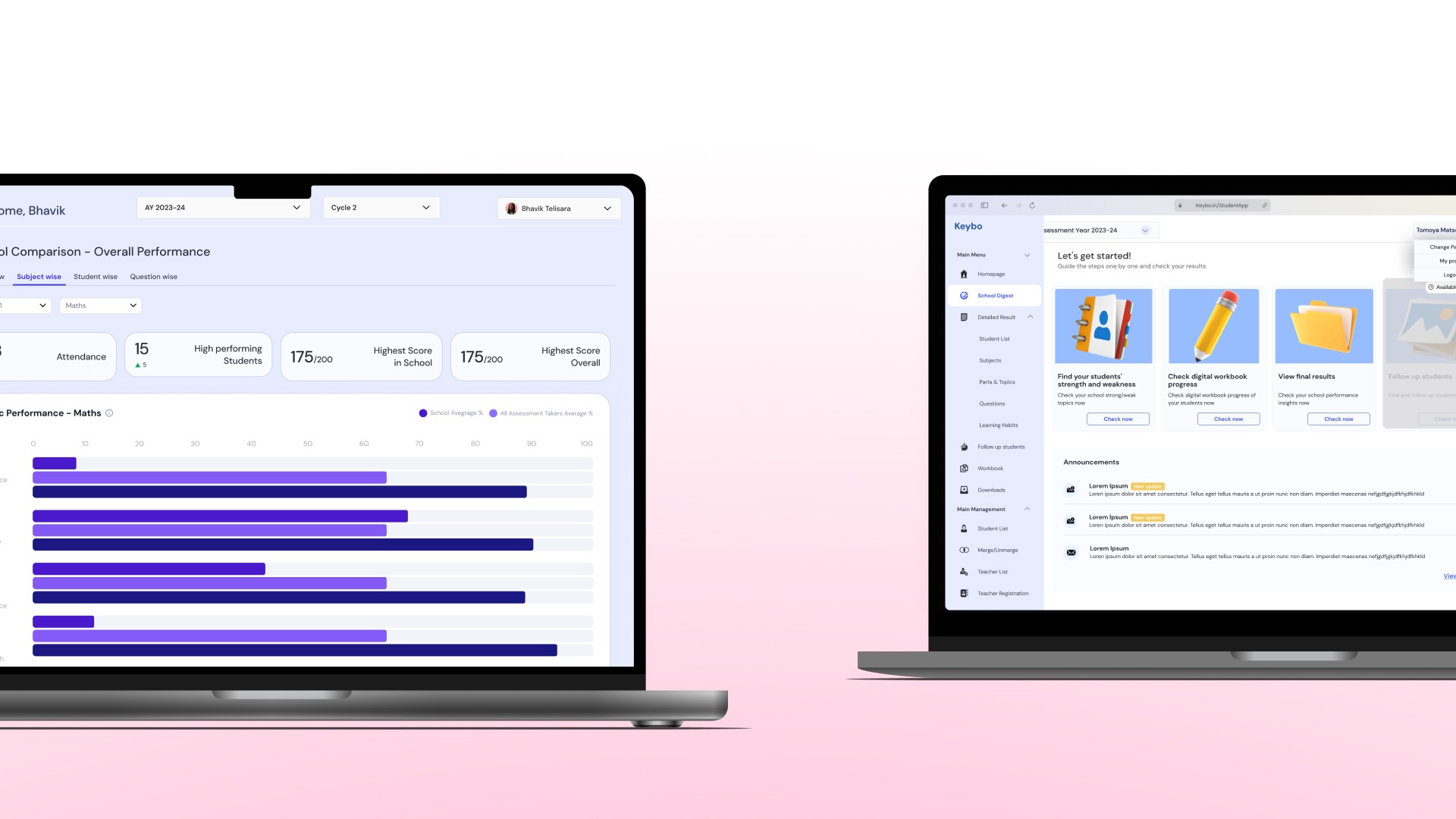
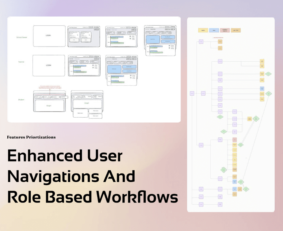
Four Roles. One Platform. Zero Shared Mental Models.
Benesse's Navigator platform served four completely different types of users simultaneously
Students, Teachers, Mentors, and Operations teams. On paper that sounds manageable. In practice it was four completely different psychological relationships with the same interface.
A student logs in thinking "what do I need to practice today?"
A teacher logs in thinking "which of my students needs help and what exactly should I do about it?"
A school owner logs in thinking "how is my institution performing overall?"
An ops team member logs in thinking "what's broken and how do I fix it before exam season hits?"
Same login screen. Same navigation. Same data architecture. Four people who needed four completely different things — and were all getting the same overwhelming wall of information.
This wasn't a design problem. This was a mental model problem. And you can't solve a mental model problem by moving buttons around.
So I did what most designers skip when they're under sprint pressure, I slowed down. I ran user interviews focused not on what features people wanted but on how they actually thought about their work. I mapped daily task execution. I traced where workflows broke down. I followed the support tickets back to their origin.
And three insights emerged that shaped every decision I made from that point forward:
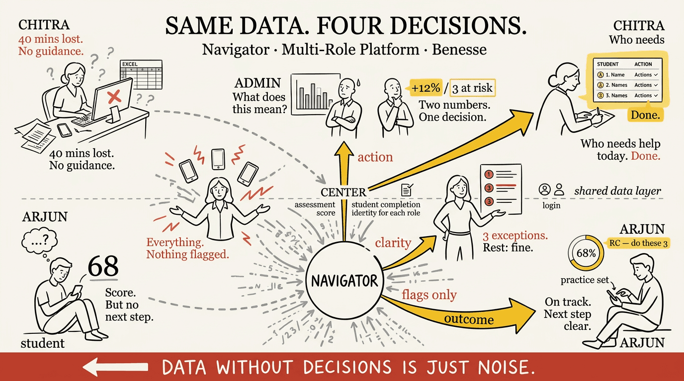
Teachers think in learning gaps, not dashboards. They don't want to see a graph. They want to know which student needs what help and exactly how to provide it.
Each role has a completely different mental model of progress. What "doing well" means to a student is nothing like what it means to an ops manager.
Access failures break trust faster than poor UI. When someone can't log in during exam season, they don't blame the login flow — they lose faith in the entire platform.
Users don't expect systems to be perfect. They expect systems to mirror how their work actually happens.
The Insight Nobody Had Written Down
Every dashboard showed aggregate numbers. Every report showed historical trends. But teachers don't think in aggregates and trends. They think in students — specific students, specific struggles, specific moments where intervention could change an outcome.
So I reframed the entire design brief from:
"How do we display learning data more clearly?"
To:
"How do we turn learning data into the next action a teacher should take?"
That one reframe changed everything — the information architecture, the navigation model, the dashboard structure, the way performance data was visualized, and ultimately the entire product roadmap.
This is also the moment my role shifted permanently. Because once you reframe the problem at that level, you're not a UI designer anymore. You're a product strategist. And the team treated me that way from that point forward.
"he most valuable thing a designer can do isn't solve the brief. It's question whether the brief is solving the right problem.
From Reporting Tool to Decision Support System
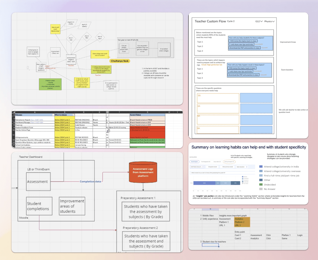
The hardest part was designing the invisible logic that connected screens.
The v1.3 scoring engine had rules. Complex ones.
A 25-year-old sees a percentage-based retirement slider.
A 55-year-old sees a direct dollar input.
A married user triggers spousal income prompts three screens later.
A user with less than 30 days of Plaid history gets a delay screen instead of an inaccurate score.
None of that is visual design. That's decision architecture.
So I built what I called the UX Brain, a logic map that lived behind every screen. Before any pixel moved, I had to answer: what does this user see if they answered this on screen two? What gets unlocked, what gets hidden, what gets reordered?
This is where design becomes product thinking.
Because when logic is wrong, no amount of beautiful UI saves the experience. But when logic is right, the interface feels almost telepathic. Like the app already knows you.
That's the feeling we were designing toward.
Great interfaces don't just look smart , they think smart. My job was to design the thinking first
Three Decisions That Changed Everything
Validated through role-based task scenarios with real users during peak exam cycles.
Tested with teachers using real planning tasks. Outcome: faster intervention setup, higher completion rates.
I made the call to prioritize operational reliability over feature velocity and monitored login failures and support tickets post-rollout to confirm the improvements held during peak exam season.
Innovation isn't adding more. It's removing everything that stands between a person and the decision they need to make.
The Numbers That Proved It
The results weren't vanity metrics. They were signals that the reframe had worked — that designing for action instead of reporting had fundamentally changed how teachers, students, and ops teams related to the platform.
+25% teacher engagement — not just more logins, but deeper integration into daily teaching workflows. Teachers were coming back not because they had to but because the platform was telling them something useful every single time.
Teachers reported less reliance on ops teams and faster turnaround in intervention planning — the qualitative signal that the pedagogical signals decision had been right all along.
And then something happened that no brief had asked for — the platform became the backbone for an entire product ecosystem.
Navigator didn't just solve the problem it was built for. It proved that a different kind of learning platform was possible.
What Navigator Made Possible in Japan
When the Benesse Japan team started thinking seriously about AI-assisted teaching, they had a question nobody could answer from a spreadsheet — can teachers actually trust AI in a classroom context?
They'd seen what Navigator had proven in India. They knew I understood the teacher mental model deeply. And they had a vision — reduce the administrative burden on Japanese teachers by using AI to generate lesson plans, create worksheets, and streamline feedback — all while complying with Japan's stringent education ministry regulations that restricted AI from completing student assignments directly.
My role wasn't to design screens. It was to build conviction.
In Japanese enterprise culture, that means Nemawashi — the practice of building consensus slowly, carefully, and thoroughly before any decision is made. You don't present a solution and ask for approval. You have individual conversations, address each stakeholder's specific concerns, build shared understanding gradually, and arrive at the decision meeting with alignment already in place.
So that's what I did. Cross-country collaboration sessions with the Japan team. Individual stakeholder conversations to understand cultural constraints and organizational anxieties. Competitive benchmarking — Automark.io versus CoGrader — to show what the market had already validated. Heuristic evaluation of existing tools to show where they were failing Japanese teachers specifically.
The resistance wasn't about the technology. It was about trust. Japanese teachers had a fundamentally different relationship with AI tools than Western users — they needed to feel that the AI was supporting their professional judgment, not replacing it. Every design decision had to reinforce that boundary.

"The real problem wasn't 'can AI generate content?' It was 'can teachers trust it in a classroom context?' Everything I designed was in service of that second question."
What I'd Build Differently
What I'd do differently:
I'd push for longitudinal impact tracking earlier. We measured engagement and ops tickets — but I wish we'd tracked whether student outcomes actually improved over time. That data would have told a more complete story about whether faster teacher decisions led to better student performance. That's the question I'd go back and answer.
I'd also expand the research into cross-team handoffs earlier. The gaps between what teachers needed and what ops teams could support were real friction points that we addressed reactively rather than proactively. Designing those handoffs deliberately from the start would have accelerated adoption.
What I proved:
A designer who shows up to fix UI and leaves having built the foundation for a cross-country AI product ecosystem — that's not luck. That's what happens when you treat every project like the real brief hasn't been written yet.
My focus going forward is on designing AI-enabled systems that help people act with confidence and clarity — especially in high-stakes, real-world environments where the cost of confusion isn't just frustration. It's a student who didn't get the help they needed.
Navigator became the backbone for multiple learning products — not just a single app. That's the standard I hold myself to. Build things that make other things possible.